A red square box with two thick, pink horizontal lines that look like the mathematical “equal” symbol they’re supposed to represent, have taken social media by storm this week. The new logo came from the Human Rights Campaign as the U.S. Supreme Court hears arguments in critical marriage rights cases. Everyone from Martha Stewart to Grumpy Cat has embraced the logo, making it their own. Stewart used red velvet cake and white icing. Even Bert and Ernie from Sesame Street are having fun with the new look. The square is being mashed up with a variety of themes, memes and illustrations, as well as standing alone with no tweaks or embellishments. Those using the logo on their page range from the silly to the serious. But what matters is, the message is being heard.
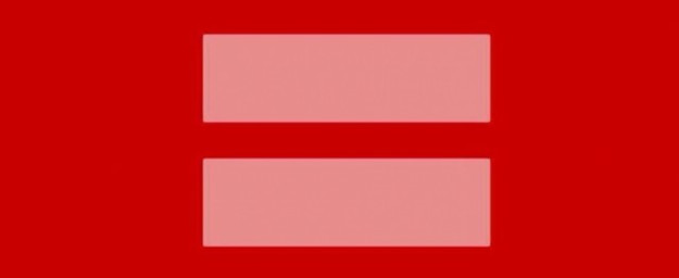
Design matters most when it’s simple and strong. By tweaking the usual blue and yellow logo to red and pink, the traditional gay rights logo remained the same, but the colors (red and pink to symbolize love and marriage) the Human Rights Campaign created a viral campaign that did exactly what the HRC wanted it to do—get people’s attention.
If there’s a cause or brand you want to promote, make it easy for your audience to adapt it and use it. Create a simple symbol your community can run with. In this case celebrities like Stewart, and Paula Deen and even cartoon characters like Bert and Ernie were able to personalize the logo to share it with their followers, Do the same. Use a simple or streamlined image or logo—something your fans and customers can copy and improve. Just like a “thumb’s up” image is a simple symbol to indicate a “like,” or to denote good things (in most countries) we all seek out unifying symbols. What does your business stand for? Make a symbol for what you stand for and post it proudly.
Read the full article at USAToday.